Creating a High-Converting Landing Page for Your Lead Generation Campaigns [With Examples]
Last updated on Monday, November 6, 2023
In the realm of digital marketing, a well-crafted landing page can be the linchpin of your lead generation efforts. It's the online gateway where visitors become potential leads or customers.
This article will delve into the pivotal role of a landing page in lead generation and provide valuable insights, backed by real-life examples, on how to create a high-converting landing page.
Whether you're new to the game or looking to fine-tune your strategy, these insights will empower you to maximize the effectiveness of your lead generation campaigns. Let's explore the key components of a compelling landing page, illustrated through successful case studies.
Defining Your Campaign Goals and Target Audience
A well-optimized landing page begins with a crystal-clear understanding of your campaign's objectives and the audience you aim to capture. These foundational elements serve as the compass guiding the design and content of your landing page.
Setting Clear Objectives for Your Lead Generation Campaign
The first step is setting clear and measurable campaign goals. Are you looking to gather email subscribers, sell a product, set an appointment or schedule consultations? Defining these objectives not only helps measure success but also ensures that your landing page's call-to-action aligns perfectly with your goals.
For example, if your objective is to increase newsletter sign-ups, your landing page should focus on enticing visitors with the value of your content and the ease of subscribing. On the other hand, if the goal is to sell a product, your landing page should emphasize the benefits and features of the product, creating a seamless path to purchase.
Identifying and Understanding Your Target Audience

For instance, if you're targeting a younger audience, your landing page might feature modern design elements, while an older demographic might prefer a more straightforward, information-oriented layout.
Tailoring Your Landing Page to Match Campaign Goals
Your landing page should be a reflection of your campaign objectives. If your goal is to gather leads for a real estate business, consider including a lead capture form to schedule property viewings. In contrast, if you aim to promote a new mobile app, your landing page should highlight the app's features and include a prominent download button.
In essence, aligning your landing page with campaign goals and target audience preferences is the cornerstone of creating a high-converting landing page. In the following sections, we'll explore real-life examples that demonstrate how these principles can be applied effectively to maximize lead generation success.
Crafting an Attention-Grabbing Headline and Subheadline
When it comes to your landing page, the first impression is often the only impression. Your headline and subheadline are your golden tickets to capturing your visitors' attention and conveying the essence of your offer. Here's how to craft compelling, attention-grabbing headlines and subheadlines that resonate with your audience.
Writing a Compelling and Concise Headline
Your headline should be clear, concise, and persuasive. In a matter of seconds, it needs to answer the visitor's key question: "What's in it for me?" A successful headline promises value, piques curiosity, or addresses a pain point.
For instance, if you're offering a weight loss program, a powerful headline might be: "Lose 10 Pounds in 30 Days: Your Path to a Healthier You." It's specific, offers a clear benefit, and creates a sense of urgency.
Using Subheadlines to Convey Value and Benefits
Subheadlines are your supporting actors, providing additional context and reinforcing the message. They should complement the headline and expand on the value proposition. Using the weight loss program example, a subheadline could read: "Discover a Sustainable Plan Tailored to Your Lifestyle." This subheadline underscores the personalized nature of the program and the long-term benefits.
Examples of Effective Headlines from Successful Landing Pages
Shopify: "Start Selling Online with Shopify: Trusted by Over 1,000,000 Businesses Worldwide" - This headline combines credibility and a clear value proposition.
Airbnb: "Earn Money as an Airbnb Host" - Airbnb's headline is simple and to the point, addressing the visitor's potential interest in earning income.
Dropbox: "Bring your photos, docs, and videos anywhere and keep your files safe" - Dropbox's headline highlights the core benefits of their service, emphasizing convenience and security.
Incorporating these principles and studying successful examples can help you create a landing page that instantly captures your audience's attention and encourages them to explore further, making it a pivotal step in boosting your lead generation efforts.
Design and Layout Optimization
Your landing page's visual appeal and user-friendliness play a pivotal role in converting visitors into leads. In this section, we explore the significance of design and layout, focusing on factors like mobile responsiveness, color schemes, typography, images and the usage of UPC while providing real-life examples of effective design choices.
The Importance of a Clean and Visually Appealing Design
First impressions matter, and your landing page's design is the first thing visitors notice. A clean, visually appealing layout is crucial for maintaining user engagement. Utilize white space, clear headings, and organized content to guide visitors seamlessly through your message. Cluttered pages can overwhelm and deter potential leads.
Mobile Responsiveness and Cross-Device Compatibility
With the majority of internet traffic coming from mobile devices, it's imperative to ensure your landing page is mobile-responsive. A page that adapts to various screen sizes provides a consistent user experience, which is essential for lead conversion. Test your page on different devices to guarantee cross-device compatibility.
The Role of Color Schemes, Typography, and Images in Design
Color psychology is a potent tool. Select a color scheme that resonates with your brand and target audience. Typography choices should be legible and consistent with your brand's tone. Engaging images and visuals that support your message can boost user engagement.
Examples of Well-Designed Landing Pages
Mailchimp: Mailchimp's landing page features a clean, well-structured design. A clear color palette, easy-to-read typography, and strategically placed call-to-action buttons make it effective in guiding visitors to sign up for their service.
Slack: Slack's landing page is an excellent example of mobile responsiveness. Whether viewed on a desktop or smartphone, the page maintains a consistent and user-friendly layout.
HubSpot: HubSpot's use of vibrant colors and informative visuals effectively conveys their message. It's an exemplary case of design aligning with brand identity and audience expectations.
By optimizing the design and layout of your landing page with a focus on mobile responsiveness, color schemes, typography, and images, you can create a visually compelling and user-friendly experience that significantly enhances your lead generation campaign's success.
Persuasive Copy and Content Creation
The success of a landing page hinges on its ability to communicate your offer effectively and persuade visitors to take action. This section delves into the art of persuasive copy and content creation, encompassing the principles of concise writing, benefit and feature highlighting, objection handling, and real-world examples of compelling copywriting.
Writing Persuasive and Concise Content
Clarity and conciseness are paramount in your content. Visitors have limited attention spans, so your message must be clear and engaging. Use straightforward language and eliminate jargon. Keep paragraphs and sentences short. Each word should have a purpose, guiding visitors toward your call-to-action.
Highlighting Benefits, Features, and Solutions
Your landing page should convey what's in it for the visitor. Highlight the benefits they'll gain from your offer and the features that set it apart. Be specific. For instance, if you're promoting a productivity app, you might emphasize time-saving features, increased efficiency, and reduced stress.
Addressing Objections and Concerns
Effective landing pages anticipate and address potential objections and concerns. Consider including a FAQ section or addressing objections directly within the content. If your product is more expensive than competitors, explain the added value it provides. If there's a common concern, such as data security, assure visitors of your cybersecurity measures to protect their information.
Successful Landing Page Copywriting Examples
Zendesk: Zendesk's landing page succinctly highlights its customer support software's value. It emphasizes easy setup and scaling, addressing a common concern businesses may have.
Grammarly: Grammarly's landing page showcases the solution's benefits by promising improved writing and productivity. It directly addresses the visitor's desire for better communication.
Netflix: Netflix's landing page copy is persuasive with its emphasis on personalized entertainment. It speaks directly to users, promising a tailored streaming experience.
By mastering persuasive copywriting techniques and applying them with precision, you can create a landing page that compels visitors to take action, transforming your lead generation campaigns into highly effective endeavors.
Compelling Call-to-Action (CTA) Buttons
Your landing page's call-to-action (CTA) buttons are the catalyst for converting visitors into leads. This section explores the art of designing captivating CTA buttons, employing action-oriented text, strategic placement, and provides examples of CTA buttons that have a proven track record of driving conversions.
Designing Eye-Catching CTA Buttons
First impressions are often visual, and your CTA button should immediately catch the eye. Use contrasting colors that stand out on the page but remain consistent with your overall design. Rounded edges and subtle shadows can make the button appear interactive and clickable. Ensuring that it's appropriately sized for both desktop and mobile users is crucial.
Using Action-Oriented Text for CTAs
CTA buttons should use concise, action-oriented text that compels visitors to take the desired action. Instead of a vague "Submit" button, opt for more engaging phrases like "Get Started," "Sign Up Now," or "Unlock Your Discount." The text should convey a sense of urgency and clearly indicate what will happen when the button is clicked.
Placing CTAs Strategically for Maximum Visibility
Effective CTA placement is about guiding the visitor seamlessly through their journey. Place CTA buttons where they're easy to find, such as at the top of the page, after key sections, and at the end. For longer pages, consider having multiple CTAs strategically positioned to reduce scrolling.
Examples of High-Converting CTA Buttons
Amazon: Amazon's "Add to Cart" CTA button is a prime example of action-oriented text. It clearly indicates the action and suggests a simple, low-commitment step, resulting in high conversion rates.
Netflix: Netflix uses "Join Free for a Month" to entice visitors. The offer of a free trial combined with a straightforward CTA text makes it compelling and effective.
HubSpot: HubSpot's "Get Started for Free" button uses a persuasive yet low-commitment approach, enticing visitors to explore the platform without cost.
By mastering the art of designing eye-catching CTA buttons, employing action-oriented text, and strategically placing them, you can significantly enhance your landing page's ability to convert visitors into leads, ultimately amplifying the success of your lead generation campaigns.
Lead Capture Forms and Data Collection
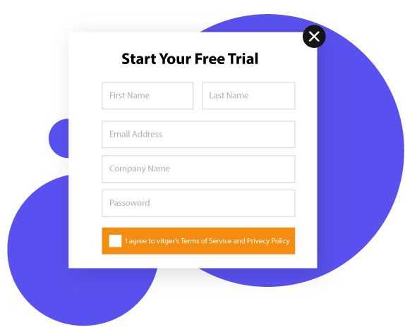
Lead capture forms are the gateways to converting your landing page visitors into valuable leads. This section focuses on crafting user-friendly and conversion-optimized forms, striking a balance between collecting essential information and reducing friction. We'll also provide real-world examples of effective lead capture forms to guide your efforts.
Creating User-Friendly and Conversion-Optimized Forms
User experience is paramount. Ensure your forms are easy to navigate, with a clear visual hierarchy. Begin with a concise headline that explains the purpose of the form. Use input fields that are easy to fill out and label them clearly. Employ a contrasting color for the submit button, making it visually distinct.
Asking for Essential Information While Reducing Friction
Striking a balance between data collection and user convenience is crucial. Ask for only the most essential information, such as name and email, for initial contact. As trust builds, you can gather more data through follow-up interactions. Minimize optional fields to reduce friction. Implement auto-formatting for phone numbers and email addresses to ensure accuracy.
Examples of Effective Lead Capture Forms
HubSpot: HubSpot's form for a free CRM trial asks for only four pieces of information: name, email, password, and company name. This minimalistic approach encourages users to start their journey with minimal effort.
Shopify: Shopify's "Get Started" form collects the necessary details for creating an online store, but it breaks the form into digestible steps, keeping the user engaged throughout.
LinkedIn: LinkedIn's registration form effectively captures essential information, like name, email, and password, while also offering users the option to sign up with one click through their Google or Apple accounts, reducing friction.
By creating user-friendly and conversion-optimized lead capture forms that ask for essential information while minimizing friction, you can streamline the lead generation process, enhance user satisfaction, and maximize the success of your landing page campaigns.
Social Proof and Trust Elements
In the world of lead generation, trust is the cornerstone of success. This section explores the art of building trust through your landing page, covering the incorporation of testimonials, reviews, trust signals, client logos, and endorsements. Real-life examples will illuminate the effectiveness of these trust-building elements.
Incorporating Testimonials, Reviews, and Trust Signals
Testimonials and reviews are powerful tools for building trust. Feature feedback from satisfied customers who have benefited from your product or service. Display ratings and reviews from authoritative websites or industry leaders to lend credibility to your offer. Trust signals such as security badges and certifications can also reassure visitors about the safety of their information.
Showcasing Client Logos and Endorsements
Displaying logos of prominent clients or partnerships can establish trust by association. When respected brands or influential figures endorse your product or service, it boosts your credibility. The "As Seen On" section, highlighting media coverage or industry awards, is another effective way to showcase external validation.
Examples of Trust-Building Elements on Landing Pages
Salesforce: Salesforce showcases client logos prominently, demonstrating the trust of industry giants like Coca-Cola, T-Mobile, and American Express. This builds trust by association for potential clients.
TripAdvisor: TripAdvisor leverages user-generated content by prominently displaying traveler reviews and ratings on hotel and destination landing pages. This approach builds trust by providing authentic feedback from fellow travelers.
PayPal: PayPal's landing pages often include trust signals such as "Buyer Protection" and "Seller Protection" badges. These reassure users that their transactions are secure and protected, reducing concerns about online payment safety.
Visuals and Media Integration
In the digital age, visuals and media play a significant role in engaging and persuading your landing page visitors. This section explores the effective use of images, videos, and graphics, the role of multimedia in conveying information, and the importance of ensuring fast loading times for media elements. Real-life examples will illustrate the impact of captivating visuals on landing pages.
Effective Use of Images, Videos, and Graphics
Visual elements are the first things visitors notice on your landing page. High-quality images, informative videos, and eye-catching graphics can captivate your audience and complement your message. The choice of visuals should align with your brand and message, enhancing the user experience.
The Role of Multimedia in Conveying Information
Multimedia elements have the power to convey complex information quickly. Videos can explain product features, demonstrate services, and tell stories that resonate with your audience. Infographics and graphics can distill data into easily digestible visuals, aiding in understanding and retention.
Ensuring Fast Loading Times for Media Elements
While visuals enhance your landing page, they must not compromise loading speed. Slow-loading media can frustrate visitors, leading to high bounce rates. Optimize images and videos for web use, utilize lazy loading to prioritize what's visible, and consider content delivery networks (CDNs) for faster loading.
Landing Page Examples with Captivating Visuals
Apple: Apple's product landing pages are renowned for their sleek design and high-quality images. They often incorporate videos showcasing product features and benefits, helping visitors make informed purchasing decisions.
Adobe: Adobe's landing pages for creative software often include instructional videos and graphics to demonstrate the software's capabilities. These visuals make it easier for potential customers to envision their own creative projects.
Mobile-Friendly Landing Pages
In an era where mobile devices reign supreme, optimizing your landing pages for mobile users is imperative. This section delves into the art of creating mobile-friendly landing pages, covering the adaptation of pages for mobile use, mobile-specific design considerations, and providing examples of successful mobile-optimized landing pages.
Adapting Landing Pages for Mobile Users
The first step in crafting mobile-friendly landing pages is to ensure they are responsive. This means your pages should automatically adjust their layout and content to fit various screen sizes, providing an optimal viewing experience. Prioritize mobile users in your design process, considering their specific needs and preferences.
Mobile-Specific Design Considerations
Mobile users have different behaviors and limitations than desktop users. Design with touch-friendly elements, larger fonts, and concise content. Ensure that images and videos are compressed for faster loading. Streamline the navigation to make it easy for users to find what they need swiftly. Also, pay attention to load times, as mobile users are less patient with slow-loading pages.
Examples of Mobile-Optimized Landing Pages
Uber: Uber's mobile landing page is a masterclass in mobile optimization. It provides a simple interface for users to book rides with minimal clicks, and it automatically detects a user's location for a seamless experience.
Google Maps: Google Maps offers a mobile landing page that focuses on providing location information. It features an easily accessible search bar and straightforward navigation, ensuring users can find directions quickly.
Spotify: Spotify's mobile landing page is designed for music discovery, featuring large album artwork and easy-to-navigate playlists. It caters to mobile users' preferences for visual content and simplicity.
A/B Testing and Optimization
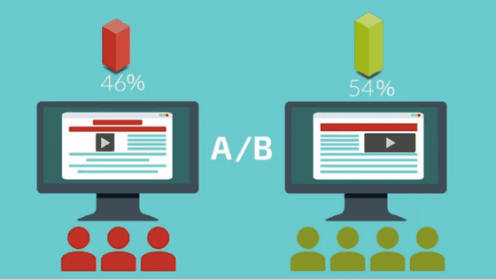
In the dynamic landscape of digital marketing, staying ahead of the competition requires continuous refinement. A/B testing, an integral part of this process, helps you assess the impact of different elements on your landing page's performance, allowing data-driven optimization for better conversion rates.
The Importance of A/B Testing for Landing Page Performance
A/B testing involves creating two (or more) versions of your landing page with one element varying between them. This element could be the headline, call-to-action (CTA) text, images, colors, or even the layout. By comparing the performance of these variations, you can identify which resonates best with your audience.
Testing Different Elements
A/B testing empowers you to experiment with various components of your landing page. You can test different headlines to gauge their impact on engagement. Test various CTAs to discover which one prompts the desired action. Experiment with images to see which visuals resonate most with your audience. These insights can be game-changers in your lead generation efforts.
Analyzing Data and Making Data-Driven Improvements
The true value of A/B testing lies in the data it yields. Analyze the metrics, such as click-through rates, bounce rates, and conversion rates, to determine which version of your landing page performs better. Use this information to make informed improvements, further refining your landing page for maximum impact.
By embracing A/B testing as a continuous process and applying data-driven improvements, your lead generation campaigns can evolve, becoming increasingly effective over time. Successful brands like Google, Facebook, and Amazon have harnessed the power of A/B testing to refine their user experiences, demonstrating the incredible impact this method can have on your conversion rates.
Measuring and Analyzing Conversions
The success of your lead generation campaign hinges on your ability to measure and analyze conversions effectively. This section sheds light on essential practices for measuring your landing page's performance, including setting key performance indicators (KPIs), tracking and analyzing conversion rates, and utilizing tools and analytics for success assessment.
Setting Key Performance Indicators (KPIs)
Start by defining clear KPIs that align with your campaign goals. Whether it's email sign-ups, product purchases, or content downloads, KPIs provide a benchmark for success. They enable you to monitor your progress and measure your landing page's effectiveness.
Tracking and Analyzing Conversion Rates and Performance
To gauge how well your landing page is performing, closely monitor conversion rates. Calculate the percentage of visitors who take the desired action. A/B testing and regular data analysis allow you to pinpoint what's working and what needs improvement.
Tools for Creating Landing Pages
Elementor: Elementor is a popular WordPress plugin that empowers users to design and build landing pages with ease. Its intuitive drag-and-drop interface, a vast library of widgets, and responsive design capabilities make it a versatile choice for creating visually appealing and functional landing pages right within the WordPress platform.
ClickFunnels: ClickFunnels is an all-in-one marketing platform known for its comprehensive suite of tools. It enables users to design, build, and optimize landing pages and complete sales funnels. With features like A/B testing and integrated email marketing, it's a solution for end-to-end lead generation campaigns.
Leadpages: Leadpages is a dedicated landing page builder with a user-friendly interface. It offers a variety of professionally designed templates and lead capture tools. Users can easily customize pages, conduct split testing, and integrate them with email marketing platforms.
Pagewiz: Pagewiz is a landing page builder designed for marketers seeking high-converting pages. It provides A/B testing, real-time analytics, and seamless integration with popular marketing tools. Pagewiz's focus on optimization makes it an excellent choice for data-driven lead generation.
HubSpot: HubSpot offers a suite of marketing and CRM tools, including a landing page builder. With HubSpot, users can create and optimize landing pages, integrate them with lead nurturing workflows, and access comprehensive analytics. It's an ideal choice for those looking for a comprehensive inbound marketing solution.
Conclusion
In the realm of lead generation, the art of crafting a high-converting landing page is a critical skill. By integrating powerful headlines, persuasive content, trust-building elements, and strategically placed CTAs, you can captivate your audience and drive conversions.
Embracing A/B testing, mobile optimization, and analytical insights will further refine your strategy. The success stories and case studies of industry giants demonstrate that mastering these techniques can elevate your lead generation campaigns to unprecedented levels of success.
As you embark on your journey to create high-converting landing pages, remember that every element plays a vital role in enticing, engaging, and converting your visitors into valuable leads.

Article by:
Dipen Visavadiya
SEO Consultant
Dipen Visavadiya is a highly experienced SEO professional with a proven track record of success spanning 9+ years. His extensive knowledge of the IT, eCommerce, and SAAS domains has been instrumental in providing targeted and effective solutions for clients. Dipen specializes in assisting SAAS businesses in boosting sales through the use of advanced link-building and content marketing strategies
