Landing Page Design: 10 Principles That Will Boost Your Conversion Rate
Last updated on Tuesday, November 21, 2023
Do you have an amazing service or product that's ready to take over the digital world? But wait! Before you can start impressing the customers, you need to develop a landing page design that will convert curious visitors into loyal buyers.
Visitors arrive at landing pages after clicking a link in an email, advertisement, or social media post. They are the key element of every online marketing campaign, as they boost conversion rates and help you achieve your marketing goals.
But how do you create a landing page design that converts?
It's simple. Focused and audience-specific landing pages attract the right buyers. Of course, visuals play a great role too. We suggest keeping it minimal and sticking to the pain points. And don't forget to use a clear and actionable call to action.
Learn about conversion, design, CTA, and much more in this post, as we discuss 10 principles that will help you to design landing pages that convert.
Principle 1: Start with a clear goal
The initial step to designing a landing page that converts is to start with a clear goal. Ask yourself: Where do you want your landing page to lead your visitors? Do you want them to subscribe to a newsletter, make a purchase, or create an account?
A clear goal will help you in creating a purposeful landing page. It will ensure that all the design and content elements work towards a mutual goal. Additionally, it will help you evaluate the success of the landing page so you can determine what's working and what's not.
As per research, landing pages with a specific goal have a higher conversion rate.
Here are some additional tips for designing compelling landing pages with clear goals.
Incorporate strong verbs as your CTA. Don't say 'Learn More." Instead, say, 'Sign Up Now.'
Using color theory, use the right colors, fonts, and sizes to make your CTA stand out from the rest of the page.
Principle 2: Keep your landing page focused
The second principle of landing page design is to keep it focused. Avoid stuffing content and design elements on one page. Remember, less is more when it comes to landing pages that convert. Focus on one goal and align your design with that goal.
Follow these tips to keep your landing pages minimal and focused.
Use terminology that is familiar to the general public
Add whitespace to make your landing page less cluttered and more welcoming
Create a landing page design similar to your website or branding kit.
Pick one call to action. Don't confuse your visitors by adding too many CTAs. Keep it simple. Keep it focused.
You must have noticed that Google's Chrome web browser features a simple and direct message on its landing page: "The fast, simple, and secure browser." The design is straightforward and user-friendly, and the website uses powerful imagery to highlight Chrome's advantages.
Principle 3: Use clear and concise language
The third and most crucial principle of landing page design is to use clear and concise language. You want your landing page to be easy to read and comprehend. Avoid using technical terminology or jargon that may confuse your visitors.
Grammarly's free writing checker's home page reads simply and directly, "Improve your writing with Grammarly." The call to action is obvious and easy to follow, and the page employs straightforward language that anybody can comprehend.
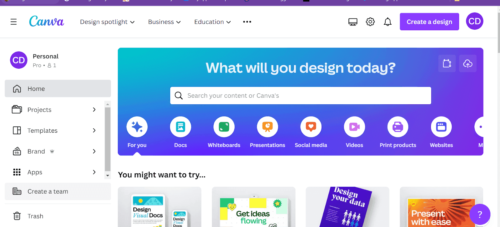
Follow these tips for incorporating more concise and clear language in your landing pages.
Avoid paragraphs and use short sentences. Add sufficient line spacing so your text is not cluttered.
Incorporate active voice since it is more persuasive and engaging than passive voice.
Use simple words but strong verbs. They make your text powerful and authoritative.
Principle 4: Use strong visuals
Visuals can help your site soar. They break the text up and make your landing page design more appealing. But that's only possible when you use high-quality graphics and images that are related to your niche.
It's important to be mindful of the images you use. You want your visitors to feel connected. The key is to use images that communicate emotions, ideas, and concepts that may be difficult to convey through texts.
Here are a few more tips to help you design engaging landing pages.
Use clear, sharp, and relevant images only
Use niche-oriented images that users can relate to
Use visuals that convey a story. Don't rely on text completely. Let the visuals sell your service.
Use persuasive visuals.
Principle 5: Use a strong call to action
A landing page without a clear call to action is like a ship without a captain. This element alone deciphers what you want your customers to do when they see your landing page. It is a compass that guides your visitors to their destination and urges them to take action.
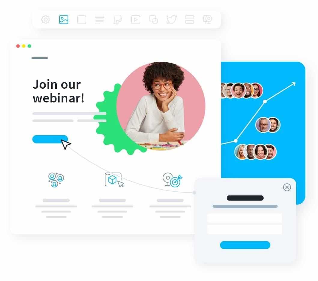
Use a call to action that is clear, concise, direct, and impossible to ignore. And remember, an engaging call to action demands attention. You can accomplish this by adding a unique button, a well-placed banner, color theory, or rightly positioned pop-ups.
Here are some ways to improve the CTA on your landing page design.
Highlight benefits and explain what visitors will gain from clicking the CTA. "Unlock New Features" is more engaging than a regular "Click Here."
Create urgency and add words like "Act Now" or "Limited Time Offer" to encourage visitors to take action.
Make sure your CTAs are responsive to computers, mobile devices, and tablets. Ensure they are accessible across all platforms.
Position your CTAs strategically. Make sure they don't disrupt the user experience but enhance it.
Principle 6: Test and optimize
Designing a landing page is just the first stage. You can witness successful outcomes when you test and refine the minute details of your landing page.
Consider your landing page to be a canvas and each test version as an experimental stroke. This idea compels you to investigate the smallest details that can transform a casual visitor into an active buyer.
The master of this process, A/B testing, points out variations, highlighting the changes that have the greatest impact on conversion rates.
Testing serves as your compass in the web world, where users' attention spans fluctuate, pointing you toward user engagement.
Principle 6, in a nutshell, says, "Now that the foundation has been established, let's polish the masterpiece." We discover the art of optimization through testing, converting speculative clicks into definite results.
Here are some points to consider when optimizing your landing page through testing:
- A/B Testing: Incorporate A/B testing to compare different variations of your landing page design. Test as many colors, headlines, and layouts till you're satisfied.
- Hypothesis: Establish a hypothesis about what parts of the landing page you want improved. This sets a basis for your testing process.
- Single Variable Change: To accurately measure the outcome of a change, test one element at a time. This will help you track which change needs fixing.
Principle 7: Use social media
Principle 7 hands you the playbook to spread the word about your product or service. Let's see how.
Step 1: Recognize who your audience is. Discover the social media sites where your ideal customers hang out. Is it LinkedIn's professional environment, the aesthetic appeal of Instagram, or the conversational space of Twitter?
Step 2: Create your story. Adjust your message to the dialect of the platform you are using. Use eye-catching images, witty captions, and relevant hashtags to draw attention.
Step 3: Interact and engage. Instead of simply broadcasting, establish connections. Participate in discussions, reply to comments, and provide something worthwhile to your visitors.
Step 4: Timing is crucial. Post when your audience is most engaged. Research the peak times for each platform, then schedule your posts accordingly. Using social media management tools is an efficient way to schedule posts.
Step 5: Utilize paid advertising. Spend money on focused advertising to extend your reach. Platforms provide detailed targeting options to get your landing page in front of the right people.
Step 6: Analyze, then adjust. The world of social media is ever-changing. Analyze analytics to determine what is working and what needs to be adjusted.
The secret to establishing your landing page's presence across social media is Principle 7. The clicks, shares, and conversions generated from social media will take your landing page far and wide.
Principle 8: Track your results
You've put your heart and soul into designing the perfect landing page, but how do you know if it's converting your visitors into consistent buyers?
You track the results.
Analytics is your map for navigating the digital world. Through analysis, you can evaluate what's working for your clients and what's not. These smart technologies offer gold-digging insights. You'll learn which pages send users straight to your checkout page and which ones send them running for the hills.
Analytics will not only provide you with data; they will also tell you a story that will help you improve your landing pages for the greatest impact.
Simply put, Principle 8 is your gateway to mastering landing pages. Put on your analytics glasses, and be ready to put your newfound knowledge to work!
Principle 9: Keep your landing page up-to-date
Stale landing pages are like yesterday's news - nobody's interested. So, let's talk about how to keep things trending. Make it a ritual to first replace outdated information with the most recent revisions. New offers? Newest trends? Add them.
But that's not all. Update it with some success stories, minimalistic design, eye-catching visuals, and high-quality content.
Keep in mind that your landing page is a dynamic component of your marketing strategy, not an outdated artifact. Principle 9 isn't just about changes; it's also about remaining relevant, converting non-believers, and providing people a reason to stay. So go ahead and improvise on your landing page, and watch the magic happen!
Principle 10: Use a landing page builder
Even if you're not a web designer or developer, you can still produce professional and polished landing pages. You can make landing pages without knowing any code, thanks to a software program called a landing page builder.
Many landing page builders are available for free, including Wix, Unbound, LeadPages, OptimizePress, and more. Similarly, you can use a website builder to create a landing page. These tools are designed to make the process seamless, eliminating the need for coding knowledge and allowing you to focus on crafting content that truly resonates with your audience.
There are several things to take into account while selecting a landing page builder, including:
- The features: Ensure the landing page builder includes the functions you require, such as the ability to incorporate forms, photos, and videos.
- The templates: You can design your landing pages using a library of templates that are commonly included with landing page builders.
- The cost: The monthly cost of a landing page builder can range from free to hundreds of dollars.
- The ease of use: If you lack any coding experience, make sure the landing page builder is simple to use.
Conclusion
Landing pages are a great tool to help you achieve your marketing goals. Following the principles sketched in this blog post, you can design converting landing pages with ease.
Keep in mind that following these guidelines will help you succeed. Each stage brings you one step closer to becoming a marketing expert, from compelling headlines to appealing visuals and catchy CTAs.

Article by:
Alina Edward
Writer
Alina Edward is a published Pakistani writer in the B2B niche, working as a full-time Head of Technical Content. Outside work, she enjoys blogging, reading, painting, and traveling the world.
