7 Types of Media to Boost Website Conversions [With Examples]
Last updated on Tuesday, December 12, 2023

You’ve done your best to create a website that sells.
You chose a responsive template, outlined your tabs, and finalized your colors. You hired experienced copywriters, web designers, and a professional photographer. You even mapped out your blog content for the next three months.
Excellent work, but you’re not done yet.
To truly create a website that converts, you need all the nuts and bolts in place. And that includes …
Drumroll, please …
Media.
The right media can hook prospects, stir up their curiosity, and even push them to conversion.
And the reason for that is simple.
Media brings copy and information to life.
From stunning images to infographics and beyond, you can use media to build meaningful connections with your prospects.
Ready to learn which media assets you can use to boost website conversions?
In today’s article, we’re taking a look at seven types you can create to turn your website into a conversion-boosting machine.
#1. Videos
Videos are a great way to explain your product or service in an easy-to-digest format.
Not only can you use video to detail your offers, but you can also use it to boost units per transaction, as Nlyte does in its educational video here:
#2. Infographics
Another effective way to turn clunky information into an easily digestible format is to sum it up with an infographic.
Sometimes an infographic can help your audience get the answers they need faster than any other type of media can. While media like videos and quizzes require a bit of a time investment, infographics are quick to scan.
And an added bonus?
Infographics are highly shareable. So if you create ones that stand out, you might have a viral graphic on your hands. Talk about boosting website conversions, are we right?
When planning your infographics, keep readability and style top of mind.
For instance, take a look at this infographic Descope created around passwordless authentication factors so their readers can easily digest this ‘complex-sounding’ option they provide.
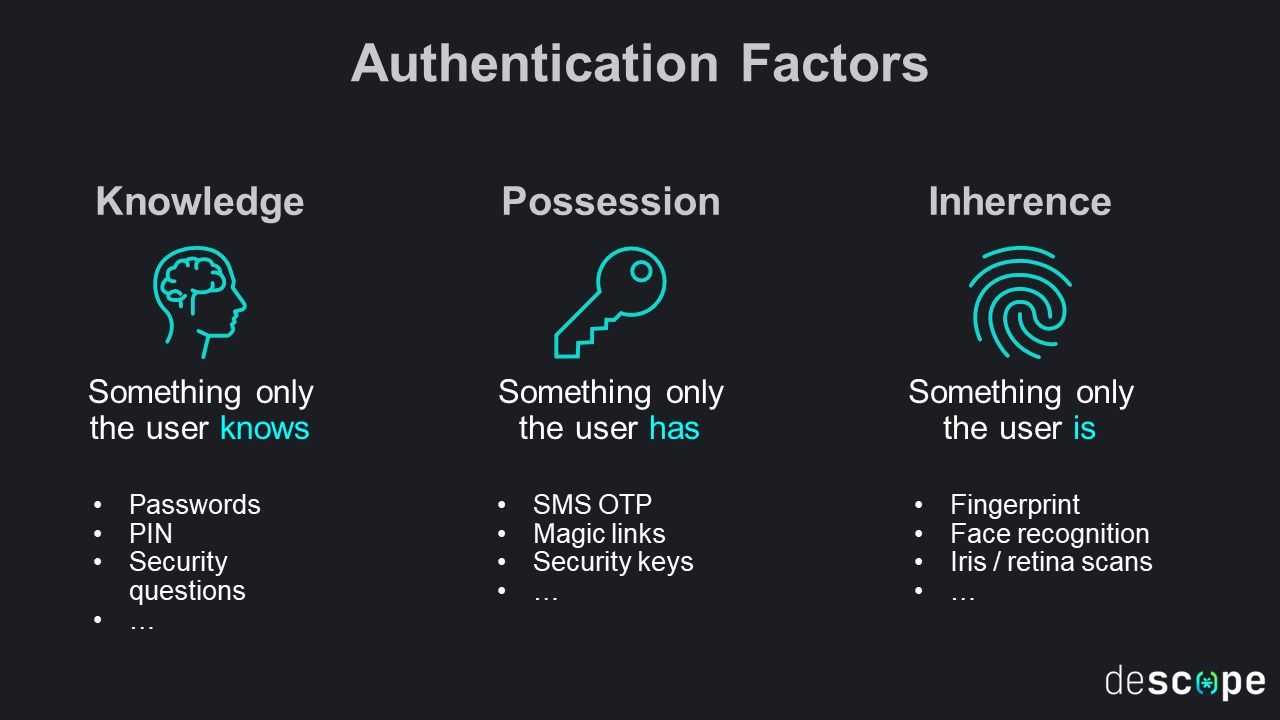
Source: Descope
In this example, Descope uses short paragraphs, bolded headers, negative space, and image icons to promote quick scanning. A cluttered infographic would defeat the purpose of this media type, so pay special attention to anything that might look distracting.
You can design your infographics to:
Sum up how a product or service works
Answer frequently asked questions
Break down a complex blog topic
Share tips and tricks
#3. Quizzes and tests
Who doesn’t love a good quiz?
Not only are quizzes and tests engaging media types, but you can also use them to optimize checkout processes.
For instance, if you sell project management software, consider adding a “How to find the right plan for you” quiz on your pricing page.
If you sell fruit and wine baskets, consider adding a “Which fruit basket are you?” quiz on your product and home pages.
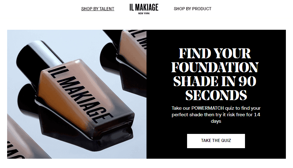
Take a look at makeup brand Il Makiage's quiz below to see what we mean:
Source: ilmakiage
In this example, Il Makiage helps prospects pick the perfect foundation shade using a short 90-second quiz — an asset that helps push its prospects one step closer to checkout.
Here are some other ways you can use quizzes to spark engagement and conversions:
Create holiday quizzes to help prospects choose the right gift to buy for someone special.
Create a time-sensitive promotional quiz. Give out prizes, discounts, and cashback to leads that scored the highest.
Use an informational quiz to test prospects on important subject matter related to your niche. After the quiz, ask them to opt-in to your email list to claim a free coupon.
#4. Images and screenshots
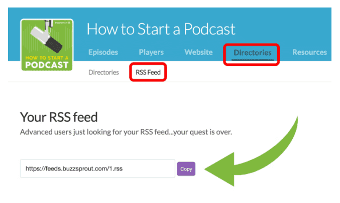
Images and screenshots are vital to breathing life into your website copy, so be sure to sprinkle them into your blog posts, product descriptions, FAQ sections, and About tabs.
Source: Shopify
But here's the deal with images … they need to be meaningful.
In other words, swap overused stock images for custom professional graphics. Choose fresh screenshots over outdated charts. And replace blurry images with crisp and clean ones.
When in doubt, refer to the following checklist:
- Does this image solve a problem?
- Does this image make the copy easier to understand?
- Does the image make sense for the current use case?
- Is the image clean and clear?
- Is the image unique?
- Is the image engaging?
- Is the image up-to-date?
If the image is a stock photo, please replace it with a screenshot or custom image
#5. Product and service descriptions
Product and service descriptions are low-hanging fruit that too many brands skip.
After all, if a prospect cares enough about you to visit your website, you can bet they'll be looking for descriptions.
If you skip adding them, you could run the risk of:
Confusing the prospect on what it is you do
Higher bounce rates since leads are unclear about what you offer
Selling an offer to a lead they don’t need or want
By adding descriptions, prospects can better understand how your offers can add value to their lives so they can make educated buying decisions.
And honestly, adding descriptions is pretty easy.
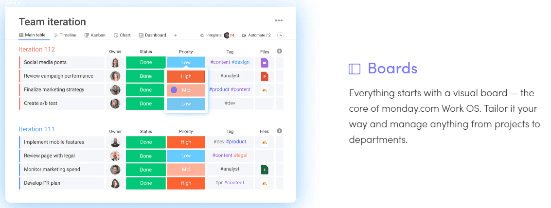
Simply start by highlighting your best sellers on your homepage along with an image next to each one.
Source: Monday
Then, create a product, services, or “work with us” tab that lists all of your offers along with descriptions and images.
Easy-peasy.
#6. FAQ banners
By now, you’ve probably noticed that one of the key ways to boost website conversions is by removing barriers to entry.
And that’s where FAQ banners work seamlessly — if you create them the right way, that is.
An FAQ banner is a rectangular image that includes a few steps about how your offer works. The best FAQ banners are based on real questions that you often get from leads and customers.
For instance, Jasmine Star, a business strategist that created a social media curating community for entrepreneurs, based her FAQ banner on a top question:
How does her community, Social Curator, even work?
So she summed it up simply and concisely in the following banner:

Source: Social Curator
While banners like these might look modest, they’re game-changers.
Not only do they answer common questions for any prospect that may land on your site, but they also:
Make it easier for leads to want to work with you
Relieve pressure off and improve the productivity of your customer service team
Relieve pressure off your marketing team
#7. Social proof
And finally … social proof! Aka, the icing on the cake.
Social proof, such as testimonials, reviews, and customer stories is essential for building trust and ease amongst your prospects.

Source: Marieforleo
Why?All brands claim that they’re the best.
They schmooze prospects with pretty graphics, click-bait, and flowery words … only to disappoint them later when the quality just isn’t there.
But social proof doesn’t lie.
If you want to go to a new restaurant this Friday, you’ll probably ask a trusted friend or read reviews online. If you want to take a vacation to Tuscany this Summer, you’ll probably read testimonials from other travelers who’ve taken the same trip.
In other words, leads trust brands more when they have social proof backing them.
You can add social proof on your home page, at the end of your blog posts, on your offers tab, and in your About section. Bonus points if you have images or screenshots that show how your offers have added value to your customers’ lives.
Wrap up
And that’s it for today, friends.
We hope this article has inspired you to think differently about media and how to use it to boost website conversions.
Remember, all you need are:
Videos
Infographics
Quizzes and tests
Images and screenshots
Product and service descriptions
FAQ banners
Social proof
And you’ll be on your way to making your website a conversion powerhouse.
Until next time!

Article by:
Joanne Camarce
Content Marketer
Joanne Camarce grows and strategizes B2B marketing and PR efforts. She loves slaying outreach campaigns and connecting with brands like G2, Wordstream, Process Street, and others. When she’s not wearing her marketing hat, you’ll find Joanne admiring Japanese music and art or just being a dog mom.
