
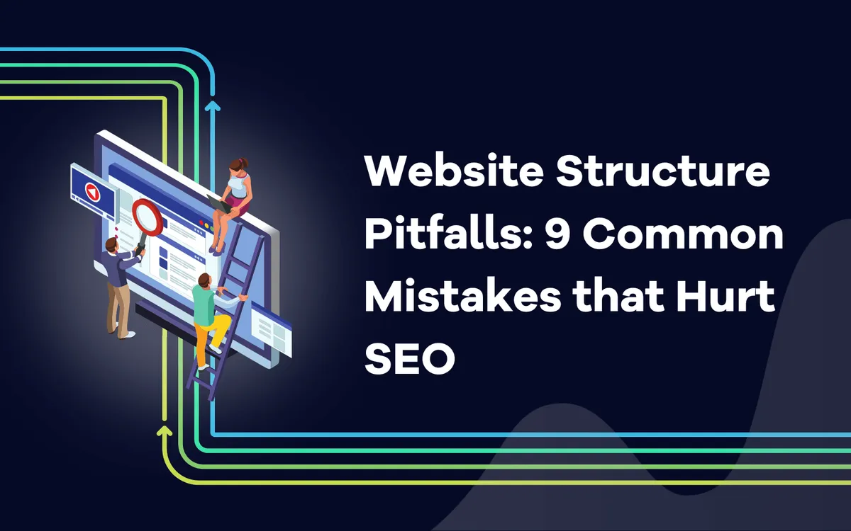
Website Structure Pitfalls: 9 Common Mistakes that Hurt SEO

Kenneth Sytian
October 22, 2023
Discover the top 9 website structure pitfalls that can damage your SEO efforts. Learn how to avoid common mistakes and improve your site's search engine ranking with our expert tips.
A straightforward website structure is an integral part of SEO, but users only notice its importance when they encounter a website with a poor design.
If you’re a website owner, you must ensure that your website does not suffer by checking out these standard website structure no-nos and avoiding them.
What is a good site structure, and why is it important?
Before proceeding, let’s first define a good site structure and why that’s important anyway.
A good website structure refers to how intuitive and straightforward it is for users to navigate your website. When you have a good website structure, your web pages connect sensibly, making it easy for users to find what they need on your website with minimal clicks and loading pages.
Now, there are plenty of reasons why you would want to prioritize a good website structure and not just because of SEO reasons, but we’ll cover those later.
According to Sytian Productions, one of the most important reasons you should care about good site structure is the overall user experience.
Think of it this way. If you hop onto a website and can’t find the things you’re looking for within a minute (or even less), you’d most likely leave the website immediately after. That’s the kind of instance you want to avoid by having a clear website structure.
As for the SEO part, paying attention to the importance of a good website structure can lead to poor visibility in search engine rankings and hinder your overall digital success.
A clear and intuitive site structure helps users stay engaged and reduce bounce rates. When you have a low bounce rate, Google or other search engines are more likely to serve your website in their search engine results pages or SERPs.
Also, search engines rely on website structures to crawl and index your pages effectively.
Therefore, when your website has a clear sense of connection between its web pages, it makes it easier for search engines to understand the hierarchy of your content, determine its relevance, and rank it accordingly.
Now that you know why it’s essential to care about how you structure your website, it’s time to cover some of the website structure mistakes that people often make that impact how optimized your site is for search engines.
#1. Not using breadcrumbs
As mentioned earlier, UX and SEO go hand-in-hand, and with a great site structure with breadcrumbs, you provide both better UX and are suitable for SEO simultaneously.
If you don’t know what breadcrumbs are, they’re these visual cues on a web page that indicate where you are on the website and what pages you’ve been to before you got to the webpage you’re on. You can usually find them on the upper left corner of a web page, before the title or headline of the content you see and below the website’s navigation menu.
It has that name because it shows a “trail” of web pages you’ve been on to get to where you are and know where to go back if needed.
Although it might not seem like that big of a deal, both literally and figuratively, since breadcrumbs should be small, that doesn’t mean the gains from having breadcrumbs are negligible.
If someone, for example, isn’t satisfied with what they saw on the current webpage, they can go back with the help of the breadcrumbs and start their search all over again. This ability is beneficial for ecommerce stores with extensive websites with huge inventory.
#2. No mobile-friendly design

Source: arngren.net
As you should discern by now, when you work on better UX design, it also has an effect on your SEO in a good way. For example, a mobile-friendly design is another way to manifest better SEO through better UX design.
It would be a little foolish not to invest in having a mobile-friendly design for your business’s website since there are more mobile users accessing the Internet these days than desktop users.
If your website doesn’t adapt well, if the screen size of the web visitor changes, then that website visitor will leave your website eventually or as soon as they get to your site. Sometimes, they’ll leave before they even see anything on your website. After all, the poor mobile-adaptiveness of a website manifests itself in insufficient loading time too.
These poor experiences for mobile users can result in higher bounce rates and lower engagement metrics. As mentioned earlier, search engines pay attention to user experience and rank websites with better mobile compatibility higher in search results.
Pay attention to the importance of a mobile-friendly design to avoid losing potential customers and hindering the growth of your online presence. Ensuring that your website structure aligns with modern standards is vital by implementing responsive design techniques that adapt seamlessly to different screen sizes and devices.
#3. Hide the main pages
Have you ever encountered a website with fancy animations on its homepage, leading you from one smooth transition to the next, when you want to go to a specific webpage on their site but can’t find it? Isn’t that annoying on your part as a web user? It makes you want to leave the website ASAP.
That’s what we mean when we talk about how you shouldn’t hide your main pages, even if you have some of the most well-crafted website graphics and animations known to humankind.
When a website’s main pages are hidden or buried deep within the site structure, search engines may need help to crawl and index them appropriately. A well-structured website ensures critical pages are easily accessible and visible to users and search engine bots.
By hiding the main web pages, you are making it difficult for search engines and your target audience to understand the relevance and importance of those pages.
When main pages are hidden, it becomes harder for search engines to recognize their significance to other content on your website.
Your navigational menu is there to help provide your main pages immediately so that your web visitors can find what they need ASAP, which is why these main pages are on your navigational menu in the first place.
#4. A large number of unnecessary categories
A common mistake that larger websites make, especially those in the ecommerce industry, is having too many category pages on their navigational menu.
When you have an excessive number of categories or category pages that are irrelevant or useful to users, it creates confusion and dilutes the overall structure of your website. When you have too many unnecessary categories or category pages, search engines may need help determining your site’s primary focus, resulting in lower rankings.
And if search engines are having a hard time determining the structure of your site, what more in the eyes of users?
Furthermore, having numerous irrelevant category pages can lead to keyword cannibalization.
In SEO, keyword cannibalization is when multiple pages on your site compete for the exact keywords, causing them to compete against each other in search engine results. As a result, these pages may rank poorly, ultimately harming your SEO efforts.
You can avoid having too many category pages by planning things out. Even if you have a large inventory of items, if you’re an ecommerce store, you should find which ones are your main category pages.
#5. Creating too many tags
Tags help organize the content of your website, so how can having them harm your SEO? While tags help with organizing and categorizing content, too many tags dilute their purpose in the first place.
Each tag represents a separate category or topic, and when there are too many of them, it thins out the main focus of each tag on your site.
Additionally, an excessive number of tags can lead to duplicate content issues. When you assign multiple tags to pages or posts with similar content, search engines may interpret this as duplicate or thin content.
It’s also similar to the too-many-category-pages problem in that it’s too confusing to navigate, and your web users might feel overwhelmed trying to use your tagging system to find what they need.
#6. Not visualizing your site structure
If you plan on organizing your website structure, you should take the time to visualize it. That way, you know how each web page leads to which ones, and it’s much easier to see where things can feel tangled up between one another.
You can also refer to your visualization to understand which pages are too isolated from the rest of your website. So, it’s also a reference to how you can improve the connectivity of your web pages from one another.
#7. No search or filter options
 Source: gatesnfences.com
Another feature you should include in your website that helps with site structure is the search or filter options.
If you’re a blog, a search feature will help users find what they need immediately without having to sift through pages and pages of your blog. For a store, a filter option will help narrow search results, especially when someone has a specific set of descriptors they want when shopping online.
#8. No clear call to action
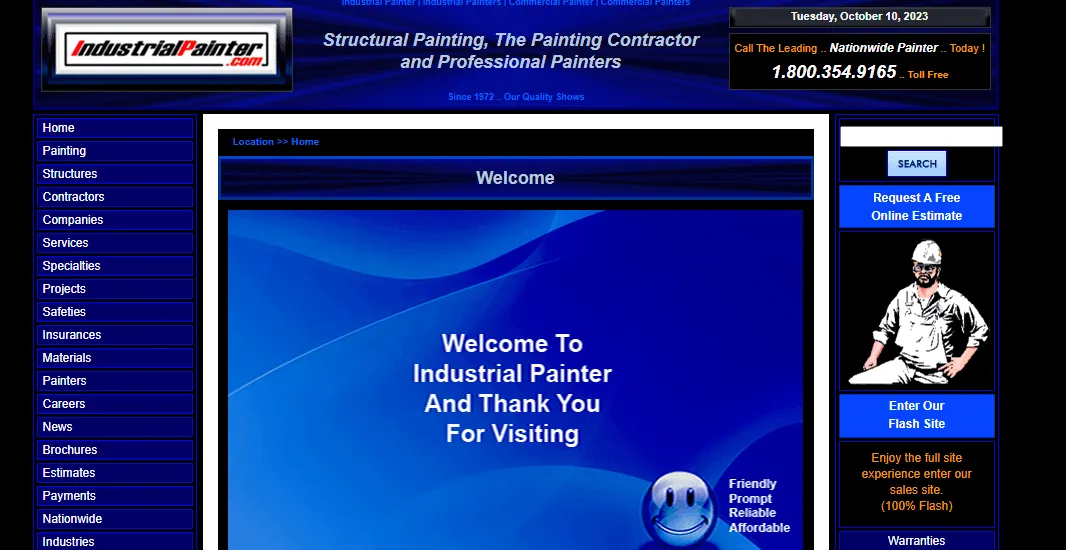 Source: industrialpainter.com
Not having a clear call to action (CTA) would hurt you more than harm other users. But it depends on how no clear call-to-action appears on your site.
If there is nothing that you’re prompting a user to do on your site, then you’ll lose out on conversions. On the other hand, if there are too many, you could lower your conversion rate based on the action you genuinely desire a user to take on your site if there are conflicting CTAs.
Ideally, each web page should only have one CTA so that it’s easier for a user to understand their next step as they’re on it.
#9. Deep or complex hierarchy
Sometimes, people need help with their website structure. They may believe everything counts as a main page or should be on their navigational menu. For example, when structuring an ecommerce website with many different products, it’s common to find an overly complex set of category pages cluttering the navigation menu.
However, if you simplify your website hierarchy, search engines and human users can get lost. It might make sense to you, but that isn’t how it will appear to other people, so mapping things out first is a crucial part of your planning stage.
Conclusion
These website structure mistakes are all solvable if you take the time to plan things out and map the structure of your website. By doing that step, you can easily avoid these common pitfalls and ensure that your website is discoverable and indexable by the search engine bots and your target audience.
Related blog posts
Why You Need Both LLM and Rank Tracking
Learn why SEOs need both rank tracking and LLM tracking to measure and understand their visibility across SERPs and AI answers.
12 March 2026
From Setup to First LLM Insights in No Time
If you have not started tracking prompts yet, this is where to begin. We show you how to go from zero setup to first LLM insights in no time.
26 February 2026
How to Choose the Right AI Visibility Tool
Learn how to choose the right LLM tracking tool to monitor AI visibility. We go through key features, integrations, capabilities, and budget.
3 February 2026