
6 Best Practices For Structuring An Ecommerce Website

Carl Torrence
September 21, 2023
Unlock E-commerce Excellence with These 6 Best Practices for Structuring Your Website – Elevate User Experience and Drive Sales!
Did you know your eCommerce website structure influences 75% of your store’s credibility? Given that you have just 50 milliseconds to make an excellent first impression and your customer’s perception is all that matters, your website’s structure and perceived ease of use are pivotal to driving sales.
Great user experience (UX) in eCommerce is a blend of intuitive site-wide navigation, individual page layouts, and product search functionality. And the best part is you have creative control of your online store.
So, how does a general eCommerce website structure look?
The best way to think of your online store is as a pyramid. Right at the top is your homepage. That is where most people enter your website and browse through other pages.
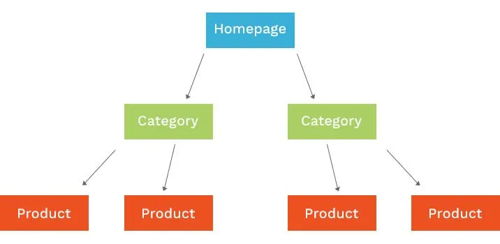 Source: Fabric.inc
Then come the categories and sub-categories, branching out like a tree. For instance, if you run an eCommerce store selling cosmetics, categories might be lip liners, and sub-categories could be matte finish, liquid lip liners, stick pencils, and so on.
Individual pages are the last layer of the pyramid, focused on a single item. For example, a liquid lip liner from a specific brand.
But why does the eCommerce site structure matter?
You see, a typical eCommerce website is bound to have a lot of pages and links. If structured properly, it allows end users to find what they want with minimum hassle.
For instance, if someone is interested in purchasing bed sheets, they can simply click on the category or type in the search bar to view all the options and choose something of their choice.
This reduces the number of steps in the sales funnel and increases the likelihood of conversions because they do not have to put much effort into checking out what they want.
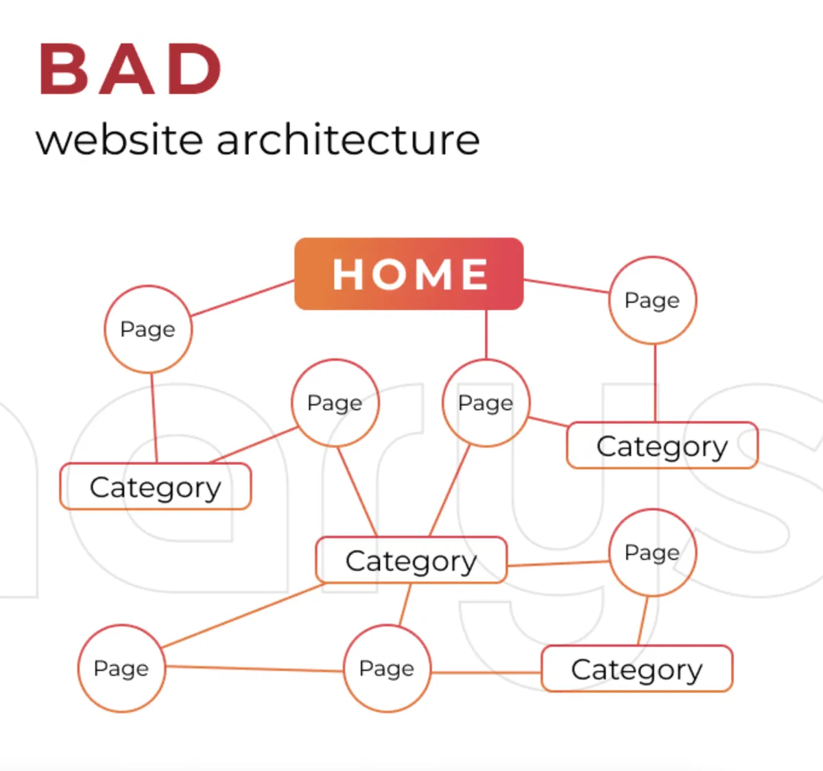 Source: Dinarys
An eCommerce site structure is also essential from an SEO perspective. When a Google crawler visits a website, it reviews the content, the meta tags, and the overall structure. It then submits its findings to the search engine’s servers for indexing purposes.
When you have all the parameters in place, you have a higher chance of getting ranked and, therefore, fetching a larger footfall to the site.
In addition, you must take care of the usual “hidden pages,” such as the privacy policy, terms of website use, and cookie policy, in accordance with the GRC policies of your business.
This ensures all obligatory pages on your eCommerce website are present, easily accessible, and not blocked from crawlers.
Best practices for structuring an eCommerce website
Now that you know what an eCommerce site should potentially look like and why a structure matters, let us take a look at how you can bolster your online store:
Establish a structured hierarchy with a maximum of three levels
With the homepage being at the top of the hierarchy, followed by the main categories (level 2), sub-categories (level 2), and individual products (level 3), there are certain things you must bear in mind:
Limit the number of categories to 10. Adding more than that will complicate things for you. Remember, you are not Amazon or eBay.
The number of sub-categories should be limited to 5-10, and this should be less than the number of sub-categories.
Do not repeat category names in sub-categories and tags, as that can make things confusing in the long run.
Chart the site hierarchy on a whiteboard or use a tool like Miro or Creately.
Understand the significance of effective eCommerce navigation
Once you have finalized your categories and sub-categories, design a user-friendly menu to display them by hovering or clicking and placing it on the top of the page. A header also comprises the cart icon and login button. Here is an example of a header menu from Allbirds:
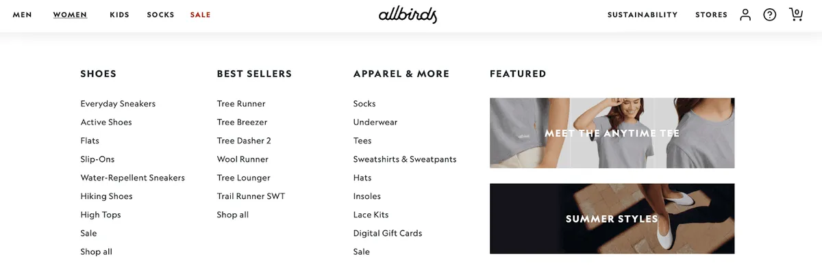 Source: Allbirds
If a customer clicks on the “Women” tab, they can see how neatly all categories are laid down. With another click, they can check out “Flats” or “Socks.” They can also check out “New to sale” products if they are simply browsing for leisure.
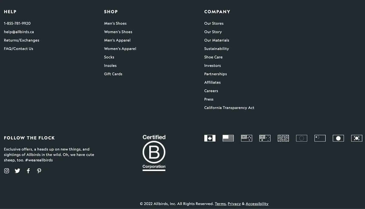 Source: Allbirds
Similarly, in the footer of your eCommerce website, put other important links such as return policy, size guides, shipping rules, terms of website use, and so on. You can add contact details, a blog sign-up box, social media links, and so on — whatever makes sense.
Lastly, do not forget about breadcrumbs. These secondary navigation types allow users to keep track of their locations within their website. They comprise the number of links they must take to return to the previous section.
For instance, on the H&M website, you can clearly see the path from the homepage to the “H&M RE:WEAR” page.
 Source: H&M
In addition to supporting user navigation and site structure, breadcrumbs get displayed in the Google search results on mobile, representing an additional advantage for your eCommerce store in the SERPs.
Manually refine your sitemap.xml for structural control
Many eCommerce website builders like Shopify automatically create and modify sitemap files. This has its pros and cons. Even though it eliminates the usual formatting errors, it does not give you the flexibility to manage the links you want to include in the sitemap.
Therefore, the best way to do it is manually. To help search engines discover and index all your pages and gain an understanding of your site’s structure, format a sitemap properly.
An ideal user sitemap displays all essential categories and sub-categories on a single page so end users can easily find what they seek.
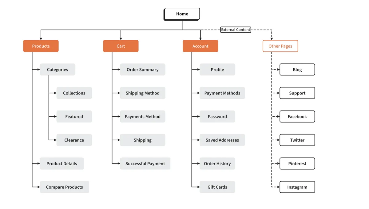 Source: Moqups
There are two more things you must remember:
Pages in the sitemap should not be blocked from indexing in robots.txt or by the meta robots tag. If you want to block specific pages, do not include them in the sitemap.
If your online store has too many pages, create separate sitemaps (as per categories) and add links to them in the skeleton sitemap file.
Lastly, add the user sitemap link to the footer, the policy pages, social media links, and so on.
Optimize and plan the URL structure to align with the site hierarchy
Your URL structure should reflect the general hierarchy on your website. For example, if you sell electronic items and have a category called “tablets,” then your site structure should look like this:

Similarly, your URL structure should resemble:
www.yourecommercesite.com/tablets/android www.yourecommercesite.com/tablets/ipad
And when one simply wants to browse through all tablets, the page should view all the Android and Apple options you have. Here are a few things to keep in mind:
Keep the URLs as short as possible.
Do not use any additional symbols or prepositions. For instance, www.yourecommercesite.com/tablets/ipad/Apple-2022-10-9-inch-Wi-Fi-256GB/-mh500-173601 is bad. Instead, use www.yourecommercesite.com/tablets/ipad/Apple-2022-10-9-inch
Having a proper URL structure on the site helps end users navigate it, and search engines index it easily.
Capitalize on media files for eCommerce SEO
Search engines use filename and alt text to understand the media content. Therefore, use descriptive names for your eCommerce store’s photos, videos, or GIFs. They should explain the media in question in a clear and readable fashion.
If you get custom photos clicked, those files may come with default names like “IMG_456.” Rename to illustrate what is shown in those pictures. For instance, “green Christmas sweater.” Similarly, write alt text to describe the appearance or function of an image or video.
This practice can greatly help improve your SEO, bringing more traffic to the site and, therefore, more conversions. This also helps in efficient site management — you can find, update, and replace specific media on the site without scouring through the backend for hours.
Implement internal linking extensively
When you interlink different categories and product pages in your eCommerce website, you solidify its structure and help search engines better assess it. Avoid having pages that do not link to anything else on the site or have no links pointing to them.
However, it is also important to note that linking for the sake of linking is also not a good practice. Here is what you should do instead:
Write blog posts to naturally link your products or categories. For example, if you sell gym gear, you can write articles on different workout techniques popular in the year and subtly promote relevant products through the body of text. That way, your links do not look forced and might even compel more readers to check out those pages.
It is a good practice to use descriptive anchor texts. However, when linking, avoid using the entire phrase. For instance, if the copy says, “ultra-comfy evening leather sandals,” link only to “leather shoes.”
Also, make your most important pages or categories easily accessible. Check out how Sephora.com promotes its latest beauty items from different companies, new Sephora moisturizers, and branded serums in the hero banner on the homepage.
 Source: Sephora
 Ensure your eCommerce website structure and internal linking adhere to compliance standards by leveraging GRC software. Such software can assist in regular audits, ensuring sensitive user data is not included in URLs or improperly linked.
Over to you
Your eCommerce website can quickly grow in size, and if you do not have a solid structure from the start, you will have a tough time keeping all the pages, categories, and links together.
Therefore, constantly monitor your site structure on Google Analytics and test different strategies for enhancing site navigation, product presentation, checkout flow, and so on.
Use your findings to develop a site structure that works for you and turn a casual browser on your eCommerce store into a loyal customer!
Related blog posts

6 Ways AccuRanker Scales with You
If your SEO tool does not scale with you, it slows you down. Here are six ways AccuRanker scales with agency and enterprise SEO teams.
24 March 2026Why You Need Both LLM and Rank Tracking
Learn why SEOs need both rank tracking and LLM tracking to measure and understand their visibility across SERPs and AI answers.
12 March 2026
From Setup to First LLM Insights in No Time
If you have not started tracking prompts yet, this is where to begin. We show you how to go from zero setup to first LLM insights in no time.
26 February 2026
